Thursday, 6 October 2011

171 Assignment 10

"Mona Lisa with Bazooka" Banksy
Retrieved from: http://www.boredpanda.com/
Postmodern and the "Remix" techniques are an important factor of modern design. After the modernism movement, critics began to come forward an express a new idea in art and design: that the modernistic, rational ideals of "Less is more", a quote from Mies Van Der Rohe, were too restricting and the freedom of individual and cultural expression and irrational art and design were more important. This was a movement spread accross America, Britain and Italy, and saw the emergence of post-modernism.

In today's society, postmodernism and the "Remix" are ideals that "are a vibrant part of our design culture today". An example of this can be seen in the Graffiti and street art reproductions of Leonardo Da Vinci's Mona Lisa. In particular I have looked at a work by the famous (or infamous, as some people see it) Banksy, of Mona Lisa holding a Bazooka. This is an example of street art, and some people would call it vandalism. Street art is a contemporary form of art expression and Banksy is famous for it, yet his real identity remains a mystery.

In this piece of work particularly he has appropriated the subject matter of Mona Lisa, from one of  Leonardo Da Vinci's most famous works, "Mona Lisa" done between the dates of 1503-1505. This is a historical reference or quotation as the Mona Lisa character is instantly recogniseable, even though she is depicted in a different way to the original painting. The symbolic nature of the bazooka in her hands alludes to the social and cultural issues of war, and the wall that Banksy has chosen to depict the image on, with the barbed wire fence running along the top, aids in the symbolism of the theme also. A hint of irony is sensed when observing the design, as to see a well known historical figure such as Mona Lisa, appropriated in this somewhat risky manner is unusual and overall causes the art to make a strong statement. This is an example of post-modern art, with the subject taken from history, and placed into a contemporary environment along with cultural/political/social symbolism, as well as being designed and carried out in a contemporary way. This aids the design's bold statement and eye-catching nature.

Wednesday, 28 September 2011

171 Assignment 9

"Designed for hospitality" Coca-cola ad 1949
Retrieved from: http://www.thejumpingfrog.com

The Cold War was a war of ideology, a war fought with ideas and often design. There was conflict between the social and political issues surrounding communism (lead by the Soviet Union) and capitalism (lead by USA). Emerging from this war came propaganda from America, in a way that showed the key to freedom was consumerism. Through marketing and design of products it was shown that happiness, success and freedom were all achieved through consumerism and the consumption of products. This was not welcomed by many European parties, with Jane Pavitt saying, "The French left-wing critic Henri Lefebvre defined Americanization as 'that ideological commodity imported in the name of technical progress, "consumer society" and the mass media." (Pavitt, 2008)

I feel that this ideology of consumerism is still fueling design and the branding of design in modern times. Today's marketing campaigns for all kinds of products pursue the idea that their product will offer the consumer a better life. In all kinds of advertisements seen, a sort of utopian life is shown, with the products in focus seeming like they create this, seducing the observer into consuming the product. 

The Coca-Cola brand has been around for over one hundred years and their advertisements are an example of the consumerist propaganda America projected during the Cold War, as well as their modern day campaigns showing the continuation of this consumeristic approach to advertising and design, as well as the "utopian" world they create. The first image below is an advertisement for a shop window from 1949. The first line reads, "Designed for hospitality" and this and the image of the perfectly happy female figure, is an example of the consumeristic propaganda, as the brand entices the consumer (in those days females) by targeting them and suggesting something of a happy, free and successful life (and good hospitality!) from consuming the product. The second image is an image from Coca-cola's 2009 "Open Happiness" Campaign, which was built off the previous campaign "The Coke Side of Life". The graphics and layout of the advertisement is different compared to the earlier example but the messages are very similar. Simply saying, "Open Happiness" is suggesting that consuming the Coca-cola product (or merely even opening it!) will result in happiness for the consumer. This shows that consumerism is still a driving force of ideology when it comes to the design and design branding today.

"Open Happiness" Coca-cola advertisement 2009
Retrieved from: http://theinspirationroom.com/daily/2009/coca-cola-open-happiness/


References:

Pavitt, J. (2008). Cold War Modern. "Design and the Democratic Ideal". V & A Publishing.


Thursday, 22 September 2011

171 Assignment 8

In 1928 Walter Gropius resigned from his director position of the Bauhaus, and Swiss-born architect Hannes Meyer was his successor. Having previously moved from a spiritual and open minded manifesto while Johannes Itten was the master of the first year course, to a more machine and mass production based manifesto while Laszlo Moholy-Nagy became involved, the Bauhaus took another turn under the leadership of Meyer. David Raizman says in "The First Machine Age of Europe", "Meyer argued that design was synonymous with man-made things and was a product of 'function x economy.'" (Raizman, 2003). He had a focus that was based around more utilitarian products such as housing, and "his approach marginalized the value of fine art in relation to design..." (Raizman, 2003). His alignment of design with a scientific model driven by new technologies and manufacturing potential caused several resignations in the Bauhaus, including Laszlo Moholy-Nagy who left shortly after Gropius.

Having seemed controversial back during the time of the Bauhaus, the position that design is a result of "function x economy" is one that I agree and disagree with. I understand that modern day design has been effected by new technologies, machines and scientific developments, and in this way I agree with this position. But what I consider to be "good" design involves other positions as well. In my eyes, good design cannot solely involve machine processes and technology as the craft of a human has to be involved somewhere in order for it to have an "aura" about it that makes it significant. The designer needs know well what the popular culture and aesthetics are at the time if they are to design well for the modern consumer.

"Yamaha VMax"
Image retrieved from; http://bestmotorcycles-pics.blogspot.com/
2011/05/yamaha-v-max-vmax-pictures.html
Saying this, I can come to the conclusion that modern day design involves both art and science not one or the other. Science and technologies are so dominant and advanced in today's world and this has effected the processes in which design is portrayed and received, and it wouldn't be the same without these developments. I believe design today is also art because no matter how technologically advanced a machine is, in order to create an "aura" that comes with great design, the craft of a human is needed, even if it is in the smallest way. Design today is about being innovative, and modern society technologies and processes need to be considered but the aesthetics of fine arts cannot be forgotten as they are involved too in creating a significant aura and are crucial parts when designing for the modern day consumer. As an example of this I have chosen a picture of a Motorcycle - (a "Yamaha VMax" to be exact!) as I feel it portrays the ideas of the balance in modern day design between science and art. This modern design is extremely technologically advanced yet the aesthetics, craft and the way it has been made is an important part of the marketing of the product. In a way the aesthetically pleasing "art" side of the product has enhanced the "science" side of it. 


References:

Raizman, D. (2003). The “First Machine Age” in Europe. History of Modern Design. New Jersey, United States: Prentice Hall Art.

Thursday, 15 September 2011

171 Assignment 7

"The Hills" Promotional Poster Season Five
Retrieved from: http://www.celebritysmackblog.com/2009/04/01/the-hills-season-5-promotional-poster/

The concept of "symbolic universe", and the connection it has to acting as a cultural and social "structure of legitimation" in the way that it somewhat organises the social world, was prominent in the World Fairs that occurred in the late 19th and early 20th centuries. These World Fairs expressed narratives of progress, and the idea that the technological advancements at the time were leading societies towards a utopian future.

This concept of a "symbolic universe" is still created in modern times, for example, through reality television. The reality television program "The Hills" is set in Los Angeles, USA, and follows the day to day lives of a group of wealthy young adults. From it's first airing on the 31st May 2006, viewers have been seduced by the cast's glamorous lives for six full seasons, every episode showing their "real" lives. With the same intensions of the concept of the "symbolic universe" the show The Hills seduces viewers into what may seem as a utopian life, but in fact is showing something unreal and inconsistent with real life. For example, in the image I have posted of a promotional advertisement for the show, the three of the main characters are shown in glamorous ball dresses, air-brushed and posed. How can this relate in anyway to real life? I cannot understand how this can come under the bracket of reality television. The world that the show depicts expresses the ideal world for some, and what they aspire too, however untrue it really is. Viewers cannot help but imagine themselves living the lives of the characters on the show.

Media and design in a modern society has implicated this construction of a "symbolic universe" because the development of television and other modern technological advancements similar, have made this image of an ideal "realistic" world easy to project and be received. The editing through new media has enabled producers of shows like "The Hills" to cram a months worth of a characters "real life" into a short 22 minute episode. Even in the promotional poster shown the figures have been photoshopped and edited to seem perfect and poised, nothing what they look like in real life. Modern media and design technologies have resulted in dramatic advancements in the way we can edit and change the way a "real", utopian world is perceived.

Thursday, 8 September 2011

171 Assignment 6

Walter Benjamin said; 
"To an ever greater degree the work of art reproduced becomes the work of art designed for reproducibility. From a photographic negative, for example, one can make any number of prints; to ask for the authentic print makes no sense." 

Benjamin had negative views on the development of scopic regimes of modernity and the then new ability to reproduce art, saying that with these new technologies that the authenticity and aura of art would diminish. He raised the question as to where fine art now sat in the developing mechanical world. Walter Benjamin saw this development concerning to the diminish of the authenticity and aura of art and I agree with his opinions. 

Modern mechanical production has allowed an incredible increase in mass distribution through replication, in vast mediums such as advertising, television, internet, film and newspapers. Walter Benjamin's response to this was that through this new ability to reproduce art on a mass scale, and distribute to the masses, the authenticity and aura of the original piece would diminish. I agree with this and use an example of Leonardo Da Vinci's, "Mona Lisa" to explain my opinion. The "Mona Lisa" is arguably one of the most famous and recognisable paintings in the world, and is displayed in Louvre Museum in Paris. Multiple replications have been made digitally of this painting, you can but replicas on tea-towels, keyrings, you name it! I believe you cannot begin to experience the aura and authenticity of this amazing piece of art when looking at theses digital replicas. I must admit I have not had the privilege to view Leonardo's amazing work in real life but can appreciate that the replicas would not offer nearly the same authentic experience and aura as the real thing. With this point I can say that there is not a role for authenticity in an age of digital design and manufacture. In this sense, replicas of art, I believe, can not offer the viewer the same authentic experience and aura, but the original can. However, I think modern mechanical production has done new and exciting things for all creative fields especially design, and new ways of creating "the authentic" and aura can come through these. 

Leonardo Da Vince, Mona Lisa, 1503-1505
Retrieved from: http://www.artchive.com/artchive/L/leonardo/monalisa.jpg.html

Sunday, 14 August 2011

171 Assignment 5

Artists have developed and influenced our understanding of "colour vision" through vast experimentation and investigation in the understanding of how colours work in conjunction with the science of vision, with light and shadow and through representation. There is an ongoing debate of colour in relation to objective and subjective truth.

The understanding of colour began with Newton's colour wheel. Newton was a scientist and had investigated the properties of colour through understanding the spectrum and white light breaking into the colour spectrum through a prism. His way of thinking about colour was scientific and rationalised, and it wasn't until another scientist, Michel Eugene Cherreul, investigated his theory of simultaneous contrast, that colour was related more to the way we perceive it. For example, the same tone of orange will look darker on a yellow background than on blue, when compared next to each other.

Goethe was the first to publicly appose Newton's scientific take on colour measurement theory, as he belived it was more subjective and less rational. Goethe states, "Painting is truer for the eye than reality itself . It presents what man would like to see and should see, not what he habitually sees." (Gage, 1999) Phillip Otto Runge and J.W.M. Turner were both artists that experimented with Goeth's theory and ideas of colours by perception and the effects of light and dark. Turner's work especially works began to develop a real sense of emotion, a sense of what it was like to be there in that moment and this was very abstract compared to the usual representational works of the time. It was an innovation as the works were more representations of the emotions rather than the actual subject matter. For example, darker colours expressed negative emotions, whilst lighter colours showed positive emotions.

With the impressionism art movement, came optical mixing of colours. This was about capturing a vision and recording what was seen directly giving a vibrant vitality to paintings. Optical mixing created true colour representation. Next the post-impressionism movement had artists like Vincent Van Gogh, who colour vision became very subjective for. Expressive colours were used to portray feelings and often the artist's psychological state. Van Gogh explains his work, "The Night Cafe" painted in 1888, "I have tried to express the terrible passions of humanity by means of red and green." (Gage, 1999)

It is clear through modern times that these experiments and explorations of colour have influenced our understanding of colour vision. I believe especially the investigations into the subjective truth of colour has influenced us, as emotions, abstraction, expressions and representativeness with colour remain large parts of innovative design today. Without the investigations of the past we would not have the same understanding of colour that we currently have.

References:

Gage, John (1999). Colour and Culture; Practice Meaning from Antiquity to Abstraction. (1st Edition). California, United States of America: University of California Press

Thursday, 4 August 2011

171 Assignment 4

"The evolution of culture is synonymous with the removal of ornament from objects of daily use." - Adolf Loos, 1908

Adolf Loos's thoughts on modern design were similar to those of other design reformists, talked about in previous blog assignment. He believed that ornamentation of objects was seductive, a way of hiding bad construction underneath, distracting, and takes away from the user experience. He also believed that ornamentation and decoration of objects in his time period, early 18th Century, held back the cultural development of civilization. In his essay, "Ornament and Crime", he says "Ornament is not merely produced by criminals, it commits a crime itself by damaging national economy and therefore its cultural development." Taking into account the culture and values of this time period, I somewhat agree with Adolf Loos. After reading his essay, I agree with his thoughts on society at the time, wasting their money and damaging the economy on expensive embellished objects when modern and simple objects were cheaper, as well as overworking craftsmen when manufacturing could take less time without the embellishments. Loos states in "Ornament and Crime", "Decorated plates are expensive, while white crockery, which is pleasing to the modern individual, is cheap. Whilst one person saves money, the other becomes insolvent. This happens to entire nations."

Saying this, I do not share the same passion as him for this point, when he explains that those who endorse ornament are "criminals" I cannot agree. With his point, "If I want to eat a piece of gingerbread I will choose one that is completely plain and not a piece which represents a baby in the arms of a horse rider, a piece that is covered over and over with decoration." I disagree. It feel as though ornamentation and decoration can increase your experience with the design. Ornamentation and what the object looks like can aid how inviting it is to interact with and use. In modern times, ornamentation of it can add pleasure to the experience, through visual stimulation and engagement, and has no relation to the culture of society or someones education. I believe an object will always be more inviting and exciting to use if it is aesthetically pleasing. 

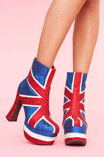
I can understand how in his time period, the past embellishment seemed unnecessary, expensive and a waste of resources and man power but bringing his thoughts into the modern times that I live in, I can argue that sometimes a little ornamentation can add to an experience, and those who use it and like it are not "criminals". I do not believe the evolution of culture was effected to the extent that Adolf Loos describes in, "Ornament and Crime" with the removal of ornamentation. Over 100 years on from when this essay was written, ornamentation and aesthetics are still an important part of design, as designers are forever pushing the boundaries, with utility and aesthetics of designs. Examples of this can be seen in a lot of footwear today. I have chosen an image of some high-heels that are more like works of art! Jeffrey Campbell is a well known fashion footwear designer and has designed these "Spicy Platform Boots". They are covered in ornamentation with the design of the union jack embellished over the shoes in glitter. The ornamentation does not relate to the utility of the shoes, but is more for the aesthetics of the design. This shows that ornamentation and aesthetics of design are still important and even with ornamentation, culture and society has evolved successfully into modern times.

Spicy Platform Boot, Jeffrey Campbell
Retrieved from: http://www.shopnastygal.com/products/new/clothing/shoes/Spicy-Platform-Boot.html


Thursday, 28 July 2011

171 Assignment 3


"Construction should be decorated. Decoration should never be purposely constructed." - The Grammar of Ornament, 1856, Owen Jones

Mini Light Trees
Sourced from; http://www.cgmdirect.com.au
 A key figure in the 19th Century Design reform, Owen Jones believed that ornamentation had to relate to the utility and purpose of the object that it was decorating. With his quote from The Grammar of Ornamentation, "Construction should be decorated. Decoration should never be purposely constructed." he is implying that ornamentation on objects and designs should be appropriate to them, through their use and utility, rather than decoration being the sole purpose of the design and having no relation to its use. Inappropriate decoration for function or ornament construction, was part of the design reform theory in the 19th Century along with other "false principles" including; imitation of nature, illusionism and imitation of architecture. "true principles" included; nature as models for ornamentation, appropriate decoration/ornamentation for use and abstraction in representation. The "true principles" evolved around the idea of honest and true design, not representation of something that the object is not. I have chosen both a historical and modern example of "decoration constructed". Both are very similar in the ways they are results of "decoration constructed" as they are both lights, imitating nature. The "mini light trees" and the "flower gas lamp" are examples of decoration that does not relate to the function of the design. The decoration and design of these two lights do not aid or improve the functionality, and are merely for decoration purposes, therefore are examples of "decoration constructed". Not only this, they also have a "false principle" of imitating nature.

Flower Gas Lamp
Sourced from; Week 3 Lecture "Beauty + Utility"


I agree and disagree with this thinking, because I feel that decoration and ornamentation should relate to the function of a design to an extent but particularly in modern and contemporary designs, there is a bit of fun to be had when juxtaposing objects with their functions. An example of this is the "mini light trees" shown above, I think they are playful and exciting in a modern design sense, as well as aesthetically pleasing. This is just my personal opinion however, and does not relate to the beliefs of Owen Jones and the ideas of the design reform in the 19th century.


Thursday, 21 July 2011

171 Assignment 2


Joris Laarman, Heatwave Radiator, The Netherlands, 2003

Joris Laarman's heatwave radiator is an example of the "continuing curve" in modern times. The decorative curvature in the design of the panels are similar to those seen in the Rococo style and is a reason to believe that it is influenced by "sensual impulse". However, this point can be argued as the Rococo style elements are designed to emit more heat through the larger surface area, so there is more to this heater than just aesthetics. Originally, Rococo style was about embracing feminine, organic, asymmetrical, curving aesthetics to designs which were focused on beauty rather than functionality. This heatwave radiator is a modern example of the Rococo style, yet has been combined with functionality. With this in mind, it is fair to say that at first glance this design looks to have aspects of sensual impulse, but in fact is more about function, and unlike earlier Rococo styled pieces, this object is shaped and decorated the way it is, for a purpose that is tactile, not merely decorative. This leads me to believe that Joris Laarman's heatwave radiator is not a result of "sensual impulse".

Thursday, 14 July 2011

171 Assignment 1


Archeology discoveries suggest that the wheel was first invented around 8,000BC in Asia. The wheel was the first major revolutionary design discovered by human and this is why it is important. Even thousands of years ago, design evolutions were taking place and development with design was initiated.

Sunday, 12 June 2011

The Letter


I decided to show my letter visually, written in lipstick on a mirror in a girls bathroom. The use of the lipstick on the mirror relates to Maybelline, as the body image issue usually revolves around mirrors and what women see and criticize when they look at their reflection. The effect of this composition resulted in a sterile feeling, which relates to the depression and other emotional disorders relating to negative body image.

Here is a typed transcript of my letter:

Dear Maybelline,

Maybe she's born with it. Maybe it's Maybelline. But probably it's photoshop. 

Body. Image. Two words that I am sick to death of. 
It is due to companies like you, that those two words have become an overwhelming issue for young females like me. The amount of advertisements that your company produces that are exceedingly photoshopped and airbrushed to beyond belief, is atrocious. Even at the local chemist, your stall is plastered with images of models with invisible pores, meter long eyelashes and not a spot or freckle in sight. And what do I see when I look in the mirror? Something completely different. 
I understand that in today's world, photoshopping advertisements is common amongst cosmetic organizations such as yourself, but the image you are portraying to young women is harmful. Unrealistic images are abusing females minds into thinking that they should look a certain way, and need cosmetics to make them beautiful. Alarming numbers of young women have developed emotional disorders such as depression, anxiety, not too mention eating disorders such as anorexia and bulimia from their own negative body image.
You are a company that is relying on consumer's insecurities to sell your products and I have had enough. The pressure in today’s society for females to look a certain way is overwheliming. Every women should be able to look in the mirror and see beauty, not criticism.
Maybelline, you need to adjust your advertisement campaigns in order help diminish this concerning body image issue. You must show images of women with real beauty, the way they really look. You need to celebrate flaws and realise that noone is perfect. This is the only solution into changing the unrealistic image that so many women are comparing themselves too. You can lift the morals of women all over the world through change. Be a leader in the cosmetic industry and start this change.

Holly Chapman

The Poster


I captured my poster on a clear window looking into the cosmetic department of a store. This store is filled of airbrushed cosmetic advertising campaigns, including Maybelline. I chose to show it here to capture the essence of the environment that Maybelline and other cosmetic companies sell their products in.


Using the precedent poster below as inspiration, I have created this poster. It explores the ideas of real beauty; that it should be celebrated in the media and in advertising campaigns such as Maybelline's, rather than hidden behind layers of photoshop editing and unrealistic editing. I used a mask as a symbol to convey this idea, as it represents what real beauty is hidden behind in the media. Using the grid composition, photographs capture different real women hiding behind the same blank mask, resulting in them becoming indistinguishable from another. The question at the end asks the question to why our real beauty is hidden like this, when instead it should be celebrated. 

Saturday, 11 June 2011

Poster Precedent


Precedent design for my poster. Sourced from www.typographicposters.com

Monday, 6 June 2011

The Word


I decided to use the word "PRESSURE" for my word. Using pink wool as my thread, I created the word  intertwining it through the bars in the glasses. The idea behind it relates to the pressure women face, that is created through the intense photoshopping and unrealistic images of females portrayed in Maybelline's advertisement campaigns. The "pressure glasses" represent the pressure women see when facing these unrealistic images. I gained inspiration from fashion photo shoots and editorials similar to the ones seen in Maybelline's advertisements, in the way I captured the images of my word. 

Tuesday, 31 May 2011

Group Members

My group consisted of:
Abe Hollingsworth
Nina Schotanus
Lydia Diver

Monday, 30 May 2011

Group Work: KASI Advert


Here is the Advertisement my group and I came up with for "KASI".  Our intentions were to advertise our brand in a fun and interesting way that would appeal to our target audience. We focused on the street wear aspect of the brand, and created a gritty advert through a series of clips relating to music. The advert is light-hearted and comedic, but also expresses the origin of this brand, in the slums of Kenya and the street-wear aspect particularly. The idea was, that when wearing the KASI brand, the character in the advert was able to "breakaway" (our slogan) from his surrounds and was unstoppable. 

Wednesday, 18 May 2011

Group Work: Logo and Slogan Development


Above is out final Logo. We also decided on our slogan to be "Break Away" and this is portrayed in the logo, with the triangles. Our main symbol can be recognised easily on the clothing without the name "KASI" next to it and this is something we intentionally wanted to achieve. 

Above is the development and thought processes my group went through in deciding a final logo.

Group Work: Brainstorm


Brainstorm showing my groups idea for "KASI" athletic apparel 


Tuesday, 17 May 2011

Inspiration


This is a short clip that illustrates the effects that photoshop can have when used in advertising. This was created by one of Maybelline's competitors Dove, as they campaign for "real beauty" without the photoshopping. 

Beginning of Project 3

Design concepts for the word, the poster and the letter


Initial brainstorm of my ideas on the company "Maybelline"

Tuesday, 10 May 2011

YouTube Link

Here is my YouTube link, so you can watch it in a larger screen, without it being heavily pixilated.

The Clip


My clip shows the relation culture and context has with the factors involved in design. Using Christchurch post-earthquake as an example, this video shows how culture and context designers will investigate and research all the factors that are relevant in rebuilding a fantastic city. And being from Christchurch myself, this project sits close to my heart.

Story Board


Story Board showing my intentions for my clip

Clip Ideas


Example of the aesthetics and the type of images that I will use to make my movie. I will be using photoshop to manipulate these styles of images into a stop-motion movie.


Ideas about how I am going to create my clip and what issue I will cover, in mindmap form.


Culture + Context Mindmap


Above is my mindmap about what I believe culture and context design is about.

Wednesday, 30 March 2011

Exercise 7: Type


Holly Chapman DSDN101 P1 Type

For this typography exercise, I decided to take my sound bite ("you are always a child of your time...") quite literally and gained inspiration from the child aspect. I focused on the medium in which children get creative with and came up with the idea of finger painting. The colour was important in  my type because children are often most attracted to the bright colours and these are often associated with children. The positive lines underneath were an aspect that was needed to give the finger painting shape as the letters would be unrecognizable without it. The types of letter free-handed underneath are also messy like children's. It also resembles to guides that children are often given when they are learning to write, and the way the paint breaks through the lines is childish and playful.

This is me, getting creative with my finger paint!

Exercise 6: Axo

Holly Chapman DSDN101 P1 Axo

Exercise 5: Sketch

Holly Chapman DSDN101 P1 Sketch

Exercise 4: Section

Holly Chapman DSDN101 P1 Section